Introduction
We were most interested in the between the locations of the police shootings and the region’s poverty rates since we were interested in how the police shootings could reflect the region’s level of criminal activities. The reason why we did not gather data on crime rates directly was because we thought the correlation may be too perfect and the effort put into organizing, cleaning, and plotting the data may end up providing a conclusion that requires little contemplation.
This does not mean that crime rates and the police shootings are not interesting, but for this project we wanted to take a step further and try to just look at the suspects’ race, level of threat, level of armament, and the location where the shootings happened and how these relates to the region’s economy, including poverty rates and median household income. If our modeling returns a significant result, then we are able to fathom what is at play and what are the underlying causes of the data.
The data’s limitations are that first, we cannot perform predictions about where the police shootings would be more likely to occur since we need some reference in geography or a reference as a social indicator. For example, could have calculated within each county the number of police shootings per square kilometers, but the calculated values do not have a point to reference (e.g. 10 police shootings per square kilometers) since not much research has been done to study police shootings. In addition, we are not certain if a reference like this is ethical enough.
Secondly, it is very difficult to say that there exists a “police shootings rate” since we cannot know how many events could have happened. Unlike the Body-Mass-Index or poverty rates that are from surveying a lot of people and knowing the exact proportions of people in poverty or people who are malnourished, police shootings data are from suspects that were killed and we would not know how many more would die from police shootings until future shootings take place which are not very frequent. Hence, our analysis is limited to summarizing the current data using a logistic regression and to testify and improve the model’s accuracy we may need to wait a longer time for future data to exist.
EDA
We looked at most of the variables in the dataset and wanted to sort out their relationship between each other.
Before doing the modeling of the data, we first did a simple analysis with some graphs of the shooting and poverty dataset. We looked at most of the variables in the dataset and wanted to sort out their relationship between each other and came up some questions and the answers of these quetsions will help us have a clearer and deeper understanding of the shooting dataset. Is age,race and sex part of the reasons that people are shooted by the police? These things are not decided by these victims and they cannot change these things. Are there some specific locations have more shootings than other places?
# Gender
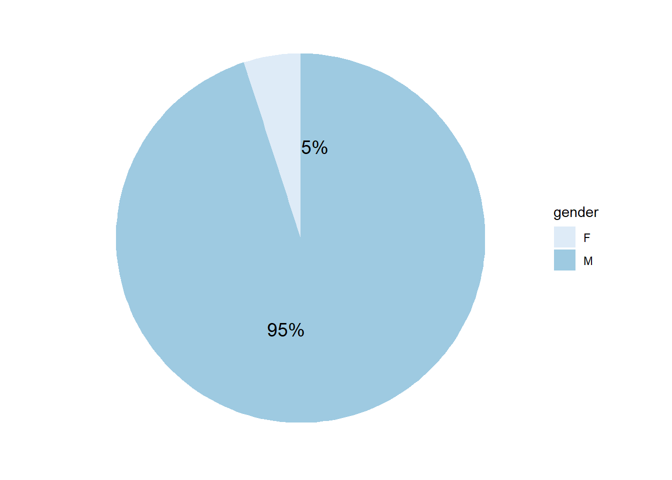
This pie chart shows the percentage of male and female who involved in cases. We can see that men take 95% of all the cases.
# Age
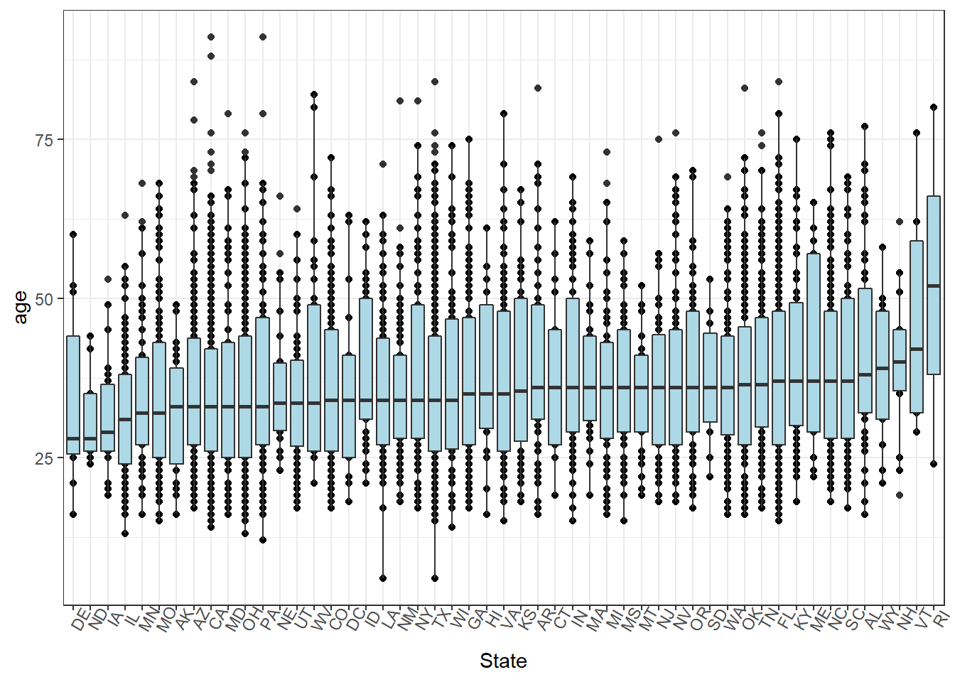
This boxplot of states and age shows that the average ages of crimes from the dataset do NOT variate a lot between different states, except for RI. We do not know the reason why the averge age is especially higher than other states, maybe we can figure it out after combing with more dataset such as income level.
# Race
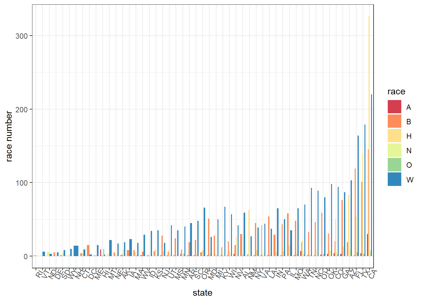
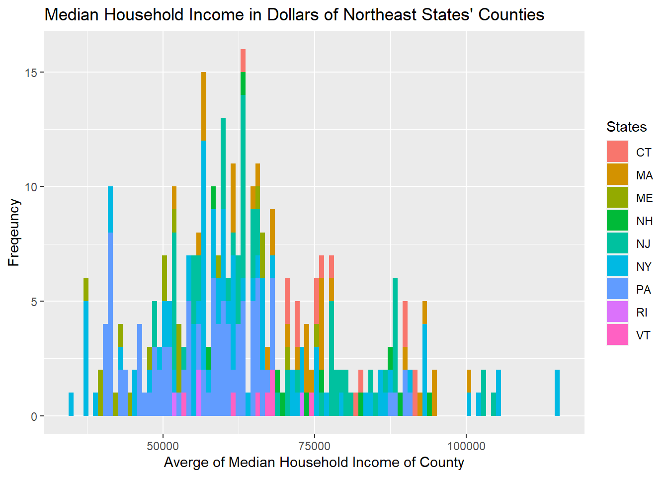
This bar chart shows the number of cases caused by different races in each state, arranging by the total number of cases, from low to high.We can see that CA, TX and Fl are the top 3 cities that shootings happen. To our surprise, although we observe that the average age in RI is the highest, it actually has the fewest cases. Among different races, it seems that white people caused most of the shootings from our dataset.
# Location and Poverty
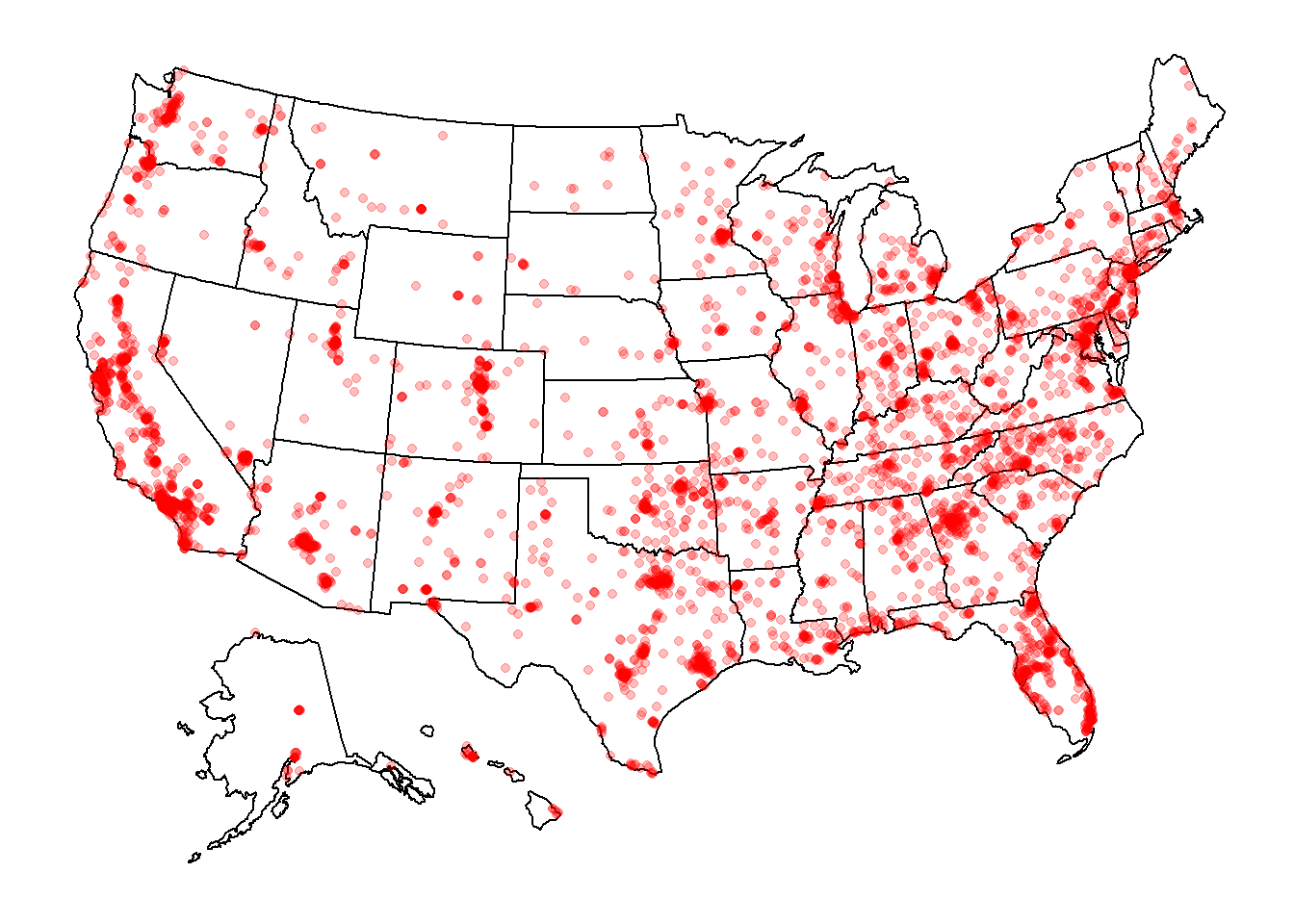
This US map shows that shootings happen intensively along west coast and 1/3 east part of the country.
After having these basic understanding of the dataset, we comes up with some new questions. From the graph of shooting locations, we know that there are some placces have more shootings than other places and we start to think about the reason behind these places. Instead of the self factors like sex, does some outside factors like poverty rate or income have important effect on these shootings? To further understand the impact of these outside factors, we use the dataset of poverty rates of the country from 2015 to 2019. Before joining this dataset to the shooting dataset, we also did some simple analysis on it.
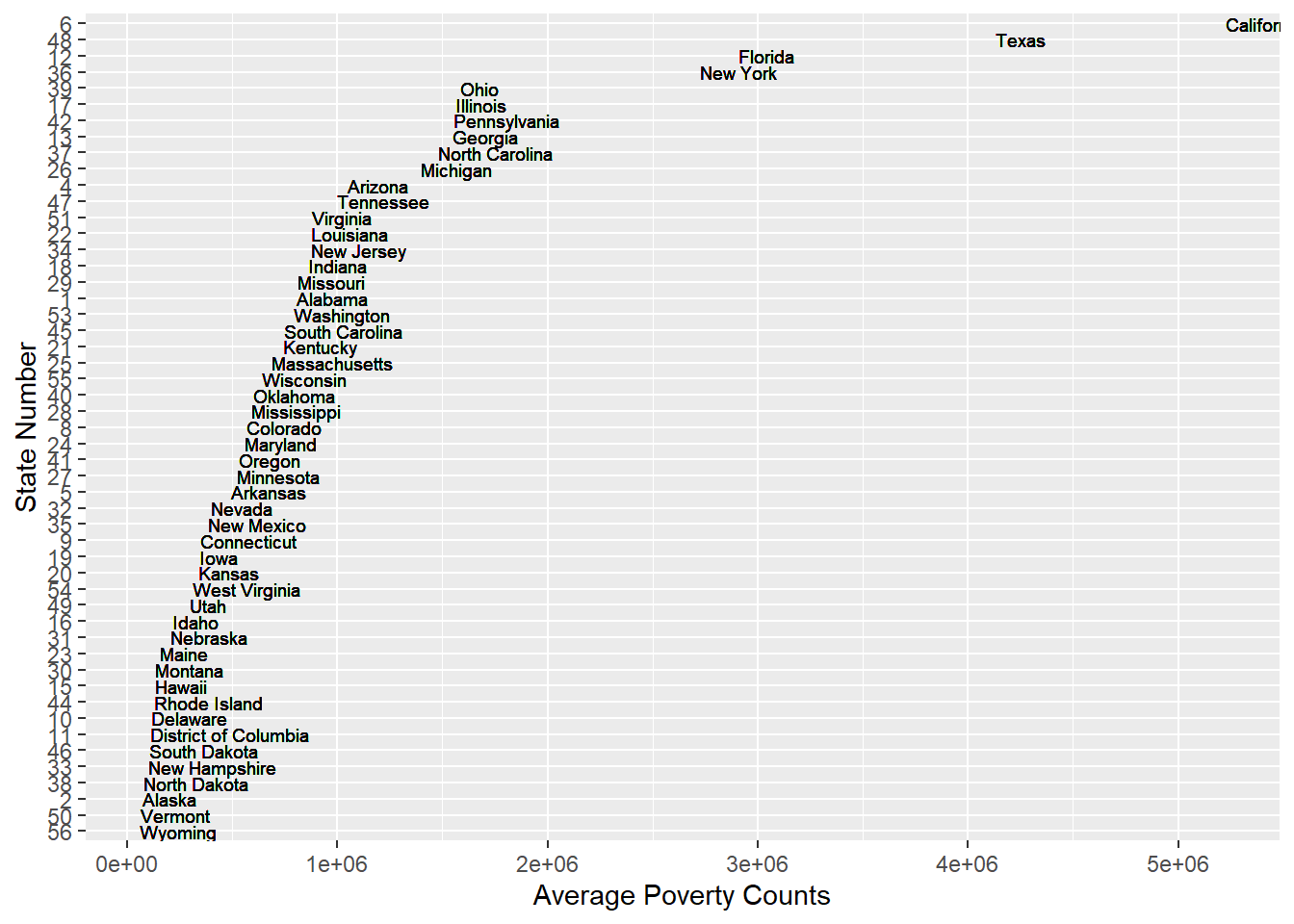
From the above graph of average poverty counts of each state, we can find that the are some gaps between the state with lots of poverty counts and state with lower poverty counts. It is not a perfect continuous line which means some states becomes outliers especially states California, Texas, New York and Florida. The reason why these states have more poverty counts could probably be that these states have more population than other states which lead to more poverty people. For instance, New York and California are big state with huge population. We have another thought that probably the higher average income of these states make the people there who are not that poor be considered as poverty. For example, New York and California are wealthy states and people live there usually have higher income which lead people who are not that poor being considered as a poor man.
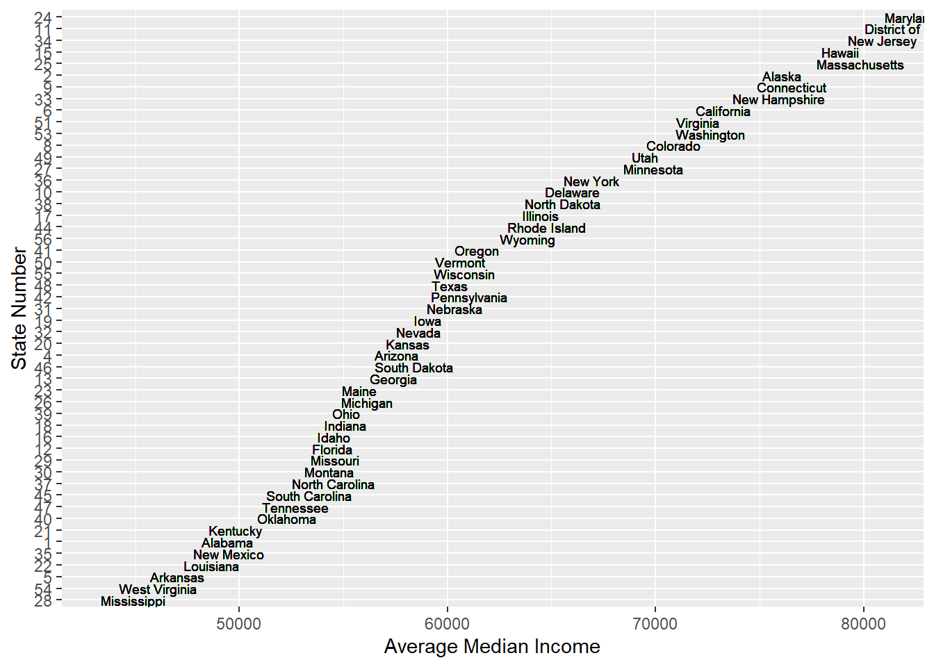
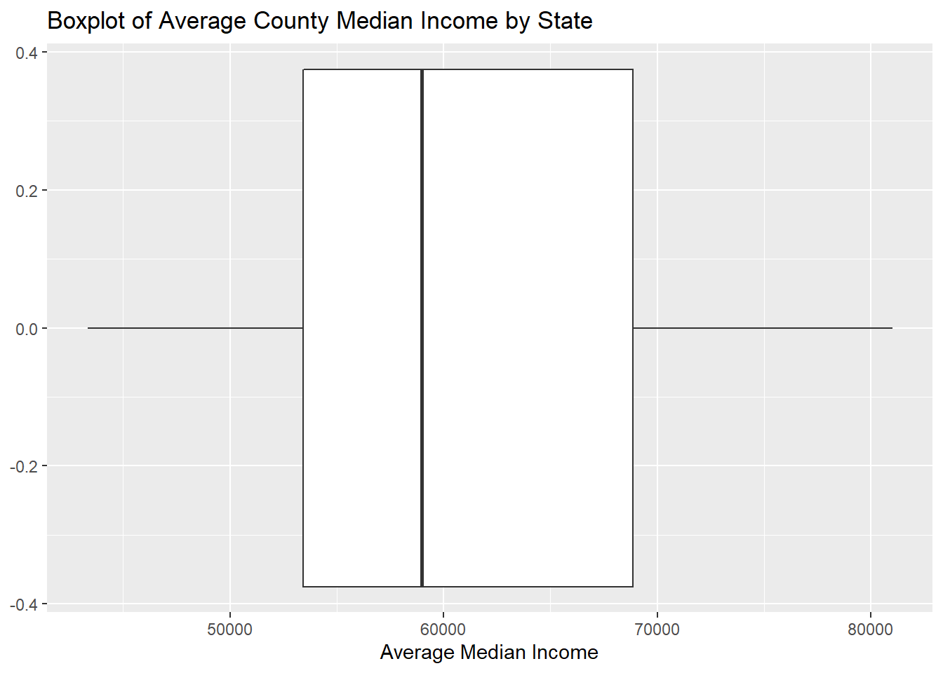
From the graph of Average Meidan income of each state, we find that one of the previous assumption is rejected. People in New York, California or Texas don’t have much higher income than people from other states. Instead, the median income of people in state which have less poverty counts are relatively high. For instance, the poverty counts of New Hampshire are really low and the median income of New Hampshire are high. Thus, population might be a potential reason for higher poverty counts and shooting cases.
Furthermore, to confirm that population is not the single factor causing more shootings, we tried to gather data on poverty rates and median income within each county and try to see if it is correlated with how the police shootings took place. The poverty information is more precise from a county level than a state level. Moreover, we utilized county rather than tract as our geographic entity. There are more than 3,000 distinctive counties and more than 73,000 tracts in the United States. There are too many tracts and mapping by tracts might be harder to explore the pattern. Besides, it is not that frequent for people to mention tract in daily life. Accordingly, using county is more reasonable and practical way to explore the relationship.
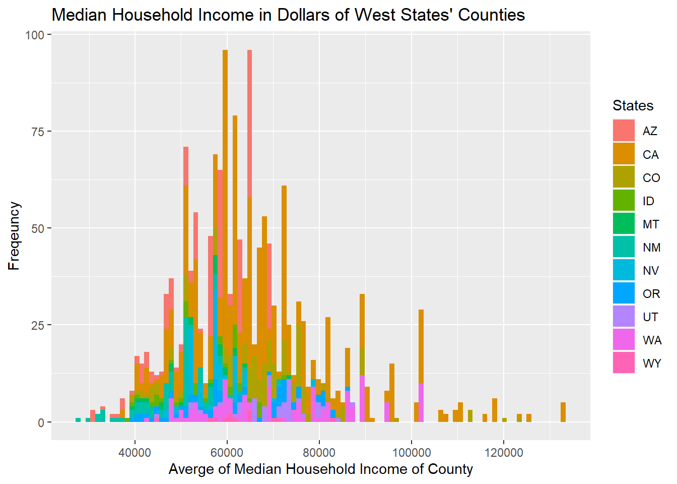
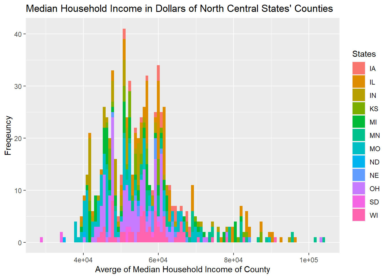
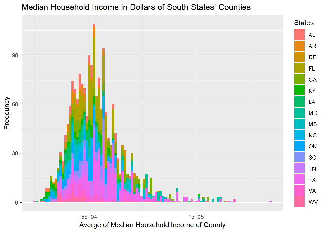
From previous analysis of the poverty condition from state level, we find that the numbers of people living in poverty of each state is distorted as California, Texas, Florida, and New York are the states with the largest populations. However, after plotting the poverty condition from the county level, we could see that the differences between average median income of each county of each state are more evenly distributed, as the curve they form is more linear. The counties’ median income’s distribution vary within each region, however, and are mostly skewed to the right.
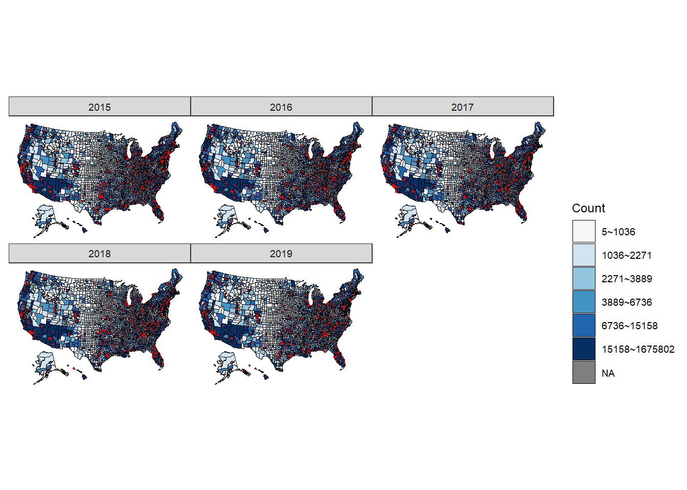
All five figures show a consistent and similar pattern. We think that based on the graph, there is a positive correlation between the location of the shootings (in red dots) and the counties that have more people living in poverty (the regions filled by darker blue). More specifically, the shootings are mostly clustered around California, Washington, central and northern Texas, Florida, East Northern coast (Massachusetts and New York), and spaced mainly within the eastern regions.
Since poverty percent would not be distorted due to the population, we decide to draw this graph using poverty percent instead of counts again and this is shown in the interactivity page. Trend on the national and state level generally follows a pattern where with higher poverty rates, the shootings tend to gather. Nevertheless, on the county level the locations are not exactly in the counties’ with higher poverty rates (as shown in the interaction element where once can see the five regions’ poverty rates across the five years). The shootings can be around the proximity of the counties with higher poverty rates.
Trend on the national and state level generally follows a pattern where with higher poverty rates, the shootings tend to gather. Nevertheless, on the county level the locations are not exactly in the counties’ with higher poverty rates (as shown in the interaction element where once can see the five regions’ poverty rates across the five years). The shootings can be around the proximity of the counties with higher poverty rates.
This could suggest that the public service including the police and security services. With a lot of people living in poverty, there may not be enough taxes collected to support police operations and hence police shootings do not necessary happen within the county. For cities and states such as New York’s Manhattan or California, both the number of people living there the amount of tax they pay are high. Hence, this may explain why, on the county level, the shootings tend to cluster on these regions rather than the counties that are truly deeply troubled by poverty.
Modeling
We first try to run a simple linear regression on the number of shooting cases of each county on the variables including both categorical variables and continuous variables: the suspects’ age, gender, race, signs of mental illness, whether they were attacking the police officer, were they fleeing, and did the officers have a body camera on them. On the state and county level, we used continuous variables including gun ownership, poverty rates of all ages, and median household income.
- Abbreviations of race:
- W: White, non-Hispanic
- B: Black, non-Hispanic
- A: Asian
- N: Native American
- H: Hispanic
- O: Other
- None: unknown
Model: Y(num_events_of_county) ~ X(signs_of_mental_illness + age + All.Ages.in.Poverty.Count + Median.Household.Income.in.Dollars + race + flee + gender + threat_level)
| Estimate | Std. Error | t value | Pr(>|t|) | |
|---|---|---|---|---|
| (Intercept) | 1.0569278 | 0.5147075 | 2.0534533 | 0.0400864 |
| signs_of_mental_illnessTrue | -0.2052974 | 0.1243819 | -1.6505402 | 0.0989024 |
| age | -0.0085123 | 0.0041926 | -2.0302997 | 0.0423848 |
| All.Ages.in.Poverty.Count | 0.0000265 | 0.0000002 | 160.8588708 | 0.0000000 |
| Median.Household.Income.in.Dollars | 0.0000183 | 0.0000035 | 5.2429667 | 0.0000002 |
| raceA | -0.0455094 | 0.4495981 | -0.1012223 | 0.9193785 |
| raceB | -1.4320686 | 0.2586268 | -5.5372013 | 0.0000000 |
| raceH | -0.1115946 | 0.2678891 | -0.4165704 | 0.6770126 |
| raceN | 0.9114200 | 0.4816112 | 1.8924393 | 0.0584967 |
| raceO | 0.1157243 | 0.5766502 | 0.2006836 | 0.8409550 |
| raceW | -0.1825931 | 0.2436082 | -0.7495360 | 0.4535734 |
| fleeCar | 0.0397534 | 0.2888725 | 0.1376158 | 0.8905502 |
| fleeFoot | -0.1461477 | 0.2969496 | -0.4921632 | 0.6226280 |
| fleeNot fleeing | -0.0586762 | 0.2662262 | -0.2203998 | 0.8255698 |
| fleeOther | 0.4119257 | 0.3964467 | 1.0390443 | 0.2988400 |
| genderM | -0.0673142 | 0.2445040 | -0.2753091 | 0.7830914 |
| threat_levelother | -0.1504182 | 0.1114140 | -1.3500838 | 0.1770571 |
| threat_levelundetermined | -0.2704824 | 0.3344034 | -0.8088507 | 0.4186438 |
The regression model only returned very few significant regressors, they are:
- signs_of_mental_illnessTrue
- age
- All.Ages.in.Poverty.Count
- Median.Household.Income.in.Dollars
- raceB (Black, non-Hispanic)
- raceN (Native American)
But essentially it did not make sense since not only we regressed counts as integers on proportions, we also lost information on the categorical variables when the counts are grouped by counties.
Hence we employed a logistic regression and treated the suspects’ races as the dependent variable since more than half of the suspects were White. Hence, we transformed the races of the other suspects as a single race of non-White and kept the same regressors. We then ran the regression but quickly realized that the regression is not as appropriate as possible since the suspect’s gender or age cannot make the suspect less or more “White”.
Certainly, for every increase in the years of age the suspect can be more or less likely to be White, but this logic is not intuitive and is not easily interpretable because there should be no uncertainty about the suspect’s race when the data is recorded. Trying to describe the pattern is thereof not as meaningful.
Model: Y = armed_with_gun
| Estimate | Std. Error | z value | Pr(>|z|) | |
|---|---|---|---|---|
| (Intercept) | 0.0937053 | 0.5038837 | 0.1859661 | 0.8524713 |
| age | 0.0165888 | 0.0027607 | 6.0089913 | 0.0000000 |
| genderM | 0.4535440 | 0.1605389 | 2.8251338 | 0.0047261 |
| signs_of_mental_illnessTrue | -0.3824409 | 0.0809766 | -4.7228596 | 0.0000023 |
| threat_levelother | -1.5923568 | 0.0727463 | -21.8891645 | 0.0000000 |
| threat_levelundetermined | -2.0065400 | 0.2480781 | -8.0883397 | 0.0000000 |
| fleeFoot | 0.8949220 | 0.1269221 | 7.0509566 | 0.0000000 |
| fleeNot fleeing | 0.3690784 | 0.0939044 | 3.9303614 | 0.0000848 |
| fleeOther | 1.0421022 | 0.2202703 | 4.7310164 | 0.0000022 |
| body_cameraTrue | -0.2126409 | 0.1037880 | -2.0488013 | 0.0404815 |
| All.Ages.in.Poverty.Percent | -0.0353244 | 0.0115580 | -3.0562678 | 0.0022411 |
| Median.Household.Income.in.Dollars | -0.0000129 | 0.0000040 | -3.1913565 | 0.0014161 |
| gunOwnership | 1.6418114 | 0.3536322 | 4.6427086 | 0.0000034 |
| new.racewhite | -0.0006590 | 0.0727739 | -0.0090548 | 0.9927754 |
To that reason, we then took gun ownership(which is also a significant x-variable) of each state in addition to the above variables and regressed on whether the suspect was armed. This fits the general intuition since we can try to find a correlation between the action of the suspects and their traits, rather than to do so for something already factual.
ArmedWithGun = age + gender + SignsOfMentalIllness + Fleeing + ThreatLevel + PovertyRate + MedianHouseholdIncome + StateGunOwnership + BodyCamera + White&NoneWhite
By taking the exponential of the coefficients, we see the percent change each regressor would have on the probability that the suspect carries a gun:
- For every increase in year of age, the suspect is 1.672% more likely to carry a gun.
- For every increase in the percent of the county’s people living in poverty, the suspect is 3.47% less likely to carry a gun. This may be true in that poverty and criminal activities sometimes are connected with each other. Hence, with fewer people living in poverty, there should be fewer crime cases.
- For every thousand dollar increase in the region’s median household income, the suspect is 1.3% less likely to carry a gun. Similarly, this could result from more people having better lives and higher incomes that can lead to fewer criminal activities.
- For every increase in the percent of the state’s people owning a gun, the suspect is 416% less likely to carry a gun. Although the coefficient is extremely high, but the data on state level gun-ownership is indeed high. The average state level population that owns guns across the US from the data we gathered is 41.96%. Hence, this could largely affect if the suspect would carry a gun.
- If the suspect is a male, he is about 57.4% more likely to carry a gun.
- If the suspect is fleeing on foot or not fleeing, or other types of fleeing, they are 144.7%, 44.64%, and 283.5% more likely to carry a gun. Though none of the types of fleeing would lead to lower probability, this is an interesting direction of further research since it seems like suspect carrying a gun would at least flee on foot rather than to stay put.
- If the suspect is white, the suspect’s 0.066% less likely to carry a gun. Though race seems to have an affect on the suspect carrying a gun or not, this effect so far seems negligible.
- If the police are wearing a body camera, the suspect is about 19% less likely to carry a gun. This is interesting since as we know, 56.14% of the suspect in the dataset carried a gun. Hence, the reason why it seems that police officers tend to have camera on them when the suspect had no gun is a little puzzling. If the suspect has a gun, it would be in the police officer’s interest to record how the shooting process happened since if the suspect is a life threat to the police, it should be recorded. Perhaps, under a rather emergent situation the police would forget to turn on the camera or forget to bring one.
- If the suspect shows a sign of mental illness, the suspect is 31.8% less likely to carry a gun. This also makes sense since suspect may be indeed troubled by mental illnesses that their cognitive abilities did not allow them to use a gun.
Some of the coefficients seem reasonable but some other coefficients seem to have too huge effects to be accurate. For instance, it is almost five times more likely that the suspect would carry a gun if the percentage of population owning a gun within a state increases by 1%. Hence, we performed a variable selection on what exactly contributes the most in explaining the suspects’ owning a gun.
| x | |
|---|---|
| (Intercept) | 0.0930568 |
| age | 0.0165844 |
| genderM | 0.4536314 |
| signs_of_mental_illnessTrue | -0.3825384 |
| threat_levelother | -1.5923483 |
| threat_levelundetermined | -2.0065231 |
| fleeFoot | 0.8949617 |
| fleeNot fleeing | 0.3690816 |
| fleeOther | 1.0420996 |
| body_cameraTrue | -0.2125932 |
| All.Ages.in.Poverty.Percent | -0.0353050 |
| Median.Household.Income.in.Dollars | -0.0000129 |
| gunOwnership | 1.6413486 |
We employed a stepwise model selection method in both forward and backward directions using the AIC as criteria. After selection, the only variable removed is whether the suspect is white or not. The remaining predictors’ coefficients did not change much, either. Hence, this suggests that race is not necessarily a dependable indicator to whether or not the suspect would carry a gun. Nevertheless, the problem of some predictors having significantly higher effects than expected remains unsolved.
## # A tibble: 10 x 3
##    .id   armed_with_gun  pred
##    <chr> <fct>          <dbl>
##  1 01    Yes            0.315
##  2 01    Yes            0.771
##  3 01    Yes            0.771
##  4 01    Yes            0.683
##  5 01    Yes            0.815
##  6 01    Yes            0.831
##  7 01    Yes            0.314
##  8 01    Yes            0.516
##  9 01    Yes            0.870
## 10 01    Yes            0.870
We use k-fold cross validation to assess the performance and estimate the accuracy of our model and here are the first ten rows of the prediction. We set k equals to 10 and the data is randomly splits into 10 subsets. One of the subset will be reserved as test data and the model will train on other subsets. This process will repeat for every subset and the parameters will be updated for each round. After 10 round of training and validation, the parameters more accurate and we compute the prediction.
## # A tibble: 3 x 3
##     acc      fpr     tpr
##   <dbl>    <dbl>   <dbl>
## 1 0.562 0.998    1
## 2 0.695 0.446    0.804
## 3 0.440 0.000528 0.00206
We are attempting to find the threshold based on the results of different cut-off we made. It seems that our threshold is around 0.5 to 0.6.
## Area under the curve: 0.7334## threshold specificity sensitivity accuracy
## threshold 0.5441043 0.5913411 0.7768152 0.6954609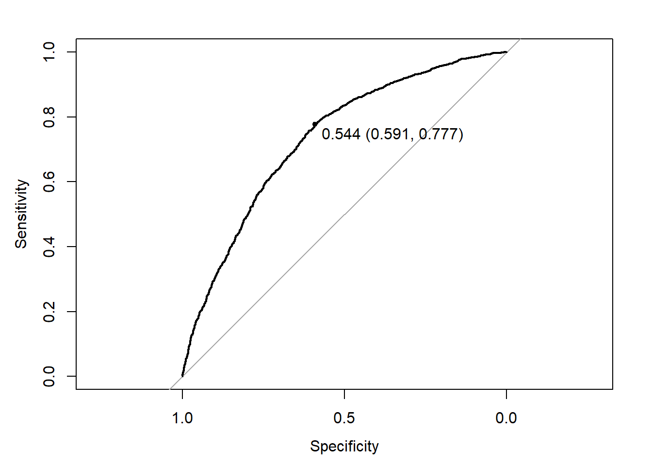
The threshold for our model is at 0.544 which is appropriate because more than 50% of the suspects are actually armed with gun. The AUC is 0.7334 and it means that we capture 73.34% of the correct predictions which suggest that our model is not bad. The accuracy of our model is 0.6954. The sensitivity (true positive rate) is 0.7768 which means that 77.68% of observations are correctly predicted to be positive out of all positive observations. The specificity is 0.5913 which suggests our false positive rate is 1-0.5913 = 0.4087. The false positive rate means that 40.87% of observations are incorrectly predicted to be positive out of all negative observations.