Data Loading and Cleaning
suppressPackageStartupMessages(library(tidyverse))## Warning: package 'readr' was built under R version 4.1.2#Load Data
shootings <- read.csv("../../../dataset/fatal-police-shootings-data.csv")
clean <- filter(shootings, age != "", armed != "", gender != "", race != "", city != "", flee != "")
clean <- na.omit(clean)
#Remove a spot not in the US
clean <- clean[-which(clean$id == 5618),]
#subset the variables about location
location <- clean[c("date","city","state","longitude","latitude")]
#omit NA and blank(missing) values
location <- na.omit(location)3 observations are deleted because of NA.
Exploratory Data Analysis
#Summary Statistics
table(clean$manner_of_death)
##
## shot shot and Tasered
## 4675 270table(clean$race) ##
## A B H N O W
## 88 1322 915 73 42 2505table(clean$state)##
## AK AL AR AZ CA CO CT DC DE FL GA HI IA ID IL IN KS KY LA MA
## 31 91 65 214 733 175 17 17 11 343 179 23 31 41 107 99 52 84 94 32
## MD ME MI MN MO MS MT NC ND NE NH NJ NM NV NY OH OK OR PA RI
## 81 17 81 62 117 61 25 145 9 26 14 54 93 87 93 145 148 79 101 2
## SC SD TN TX UT VA VT WA WI WV WY
## 73 12 132 427 60 93 7 127 86 36 13table(clean$flee)##
## Car Foot Not fleeing Other
## 728 734 3288 195summary(clean$age)## Min. 1st Qu. Median Mean 3rd Qu. Max.
## 6.00 27.00 34.00 36.67 45.00 91.00#plot shooting points on US map
suppressPackageStartupMessages(library(rgdal))
library(usmap) #import the package
library(ggplot2) #use ggplot2 to add layer for visualization
coord <- location[c("longitude","latitude")]
coord <- usmap_transform(coord)
plot_usmap() +
geom_point(data = coord, aes(x = longitude.1, y = latitude.1),
color = "red", alpha = 0.25) + theme(legend.position = "right")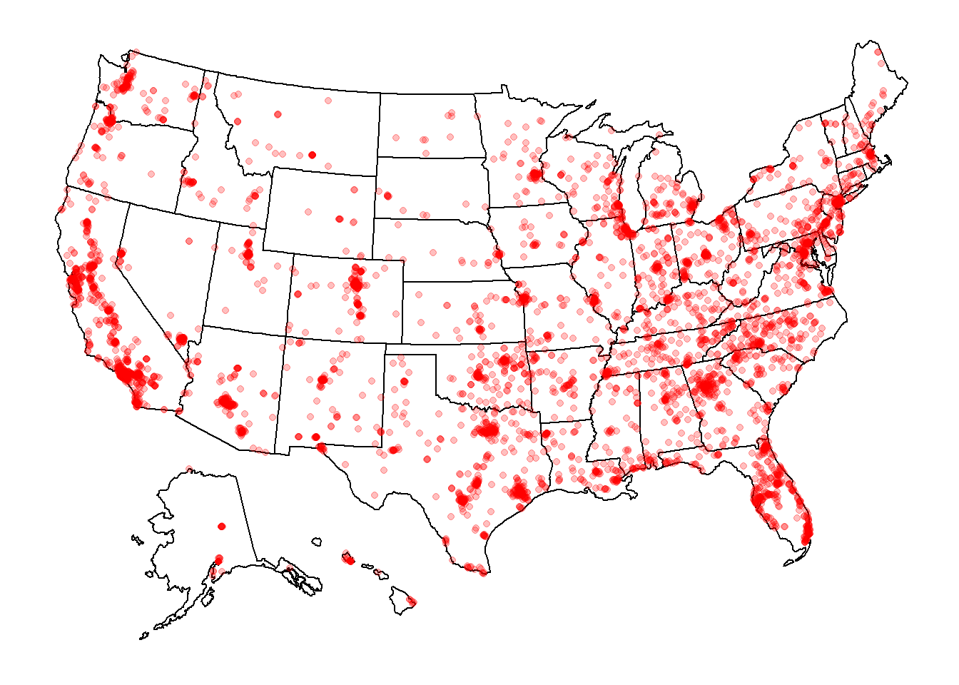
This US map shows that shootings happen intensively along west coast and 1/3 east part of the country.
clean %>%
  group_by(gender) %>%
  count() %>%
  ggplot(aes(x = "", y = n, fill = gender)) +
  geom_bar(width = 1, stat = "identity") +
  coord_polar("y", start=0) +
  scale_fill_brewer(palette="Blues") +
  theme_minimal() +
  geom_text(aes(y = n/2 + c(0, cumsum(n)[-length(n)]),
            label = scales::percent(n/nrow(clean))), size=5)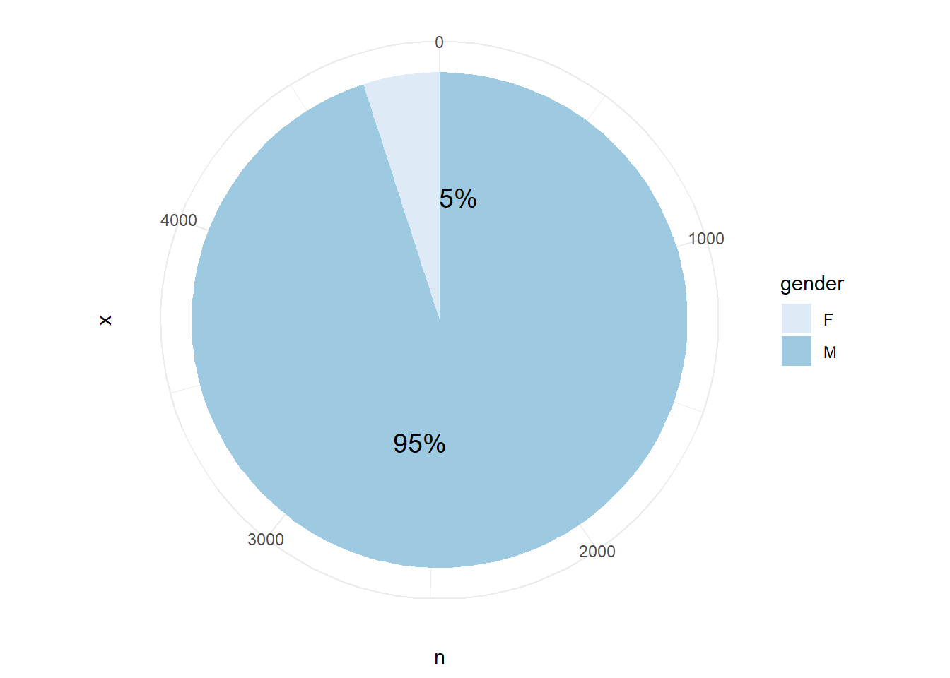
This pie chart shows the percentage of male and female who involved in cases. We can see that men take 95% of all the cases.
ggplot(clean, aes(x = fct_reorder(state, age), y = age)) +
  geom_point() +
  geom_boxplot() +
  xlab("State")+
  theme(axis.text.x = element_text(angle = 90))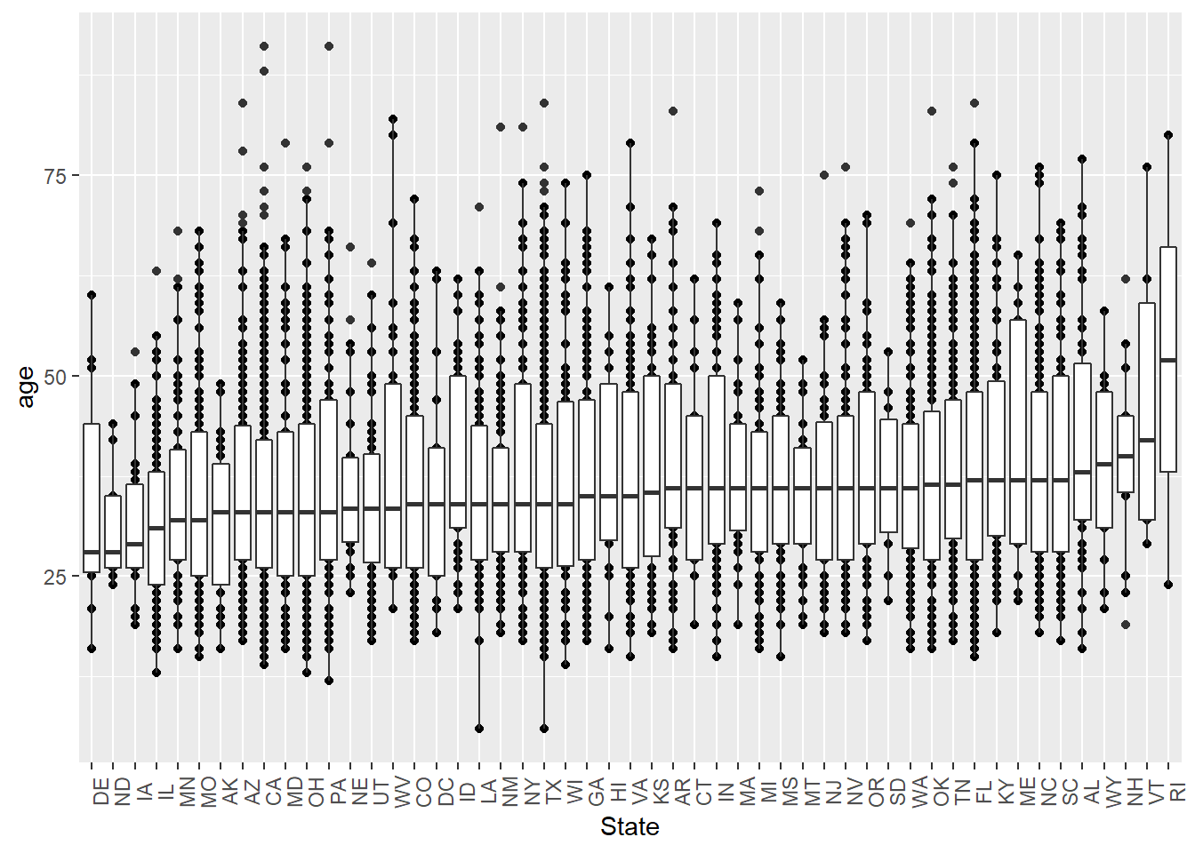
This boxplot of states and age shows that, the average ages of crimes from the dataset do NOT variate a lot between different states, except for RI. We do not know the reason why the averge age is especially higher than other states, maybe we can figure it out after combing with more dataset such as income level.
clean %>%
  group_by(state, race) %>%
  count() %>%
  ggplot(aes(x = fct_reorder(state, n, .fun = sum), y = n, fill = race)) +
  xlab("state") +
  ylab("race number") +
  geom_bar(position = "dodge", stat = "identity", width = 0.75) +
  theme_bw() +
  scale_fill_brewer(palette = "Spectral") +
  theme(axis.text.x = element_text(angle = 90))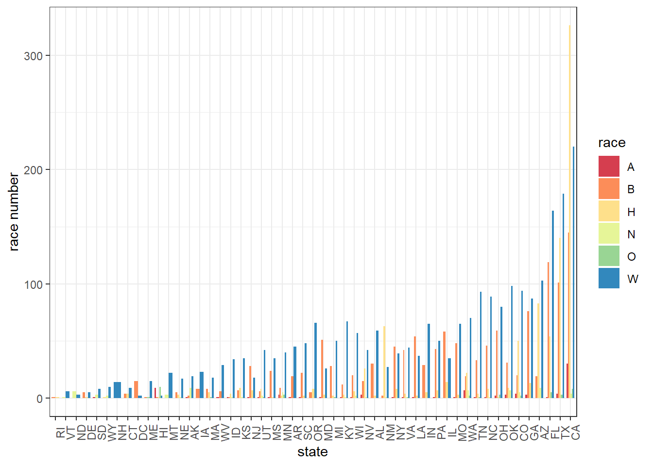
This bar chart shows the number of cases caused by different races in each state, arranging by the total number of cases, from low to high. We can see that CA, TX and Fl are the top 3 cities that shootings happen. To our surprise, although we observe that the average age in RI is the highest, it actually has the fewest cases. Among different races, it seems that white people caused most of the shootings from our dataset.
ggplot(clean, aes(x = signs_of_mental_illness, y = age)) +
  geom_boxplot() +
  xlab("Sign of Mental Illness")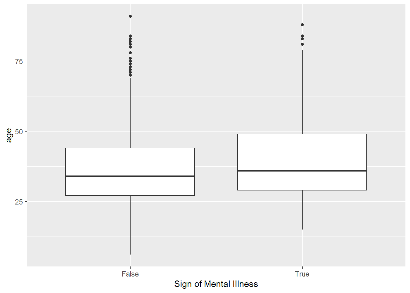
ggplot(clean) + geom_bar(aes(x = flee, fill = flee))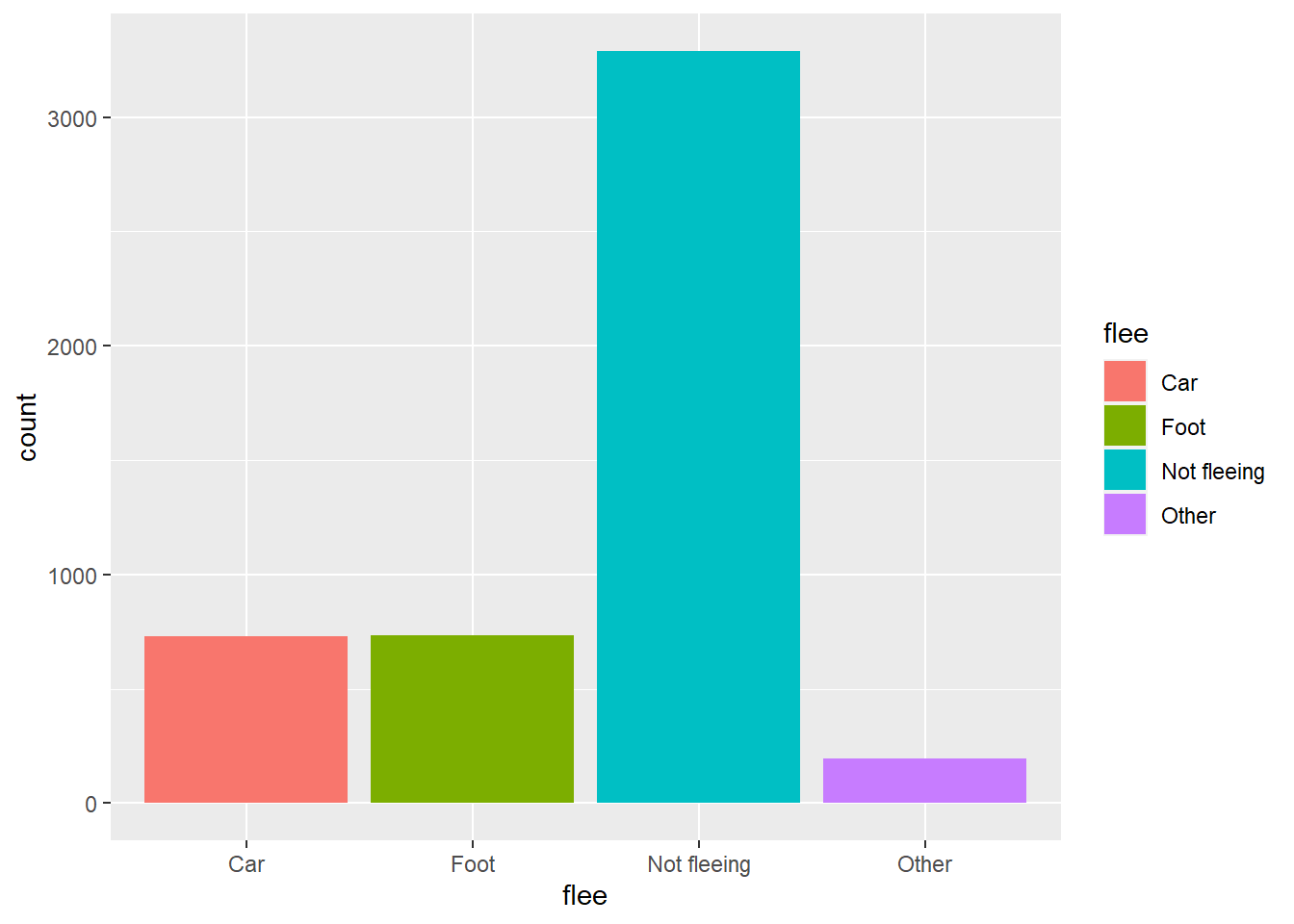
The boxplot of sign of mental illness and age shows that whether the crime has mental illness or not does NOT reflect their age information. We may use other plot or model to determine if these two factors have correlation or not. The last bar chart is a counting for flee variable. We observe that most crimes do not flee; however, we can not decide the reason for this from the dataset we have for now. For those crimes who choose to flee, they seems prefer to drive cars or just run away.