For this week, we joined three datasets together: 1) the poverty data “Small Area Income and Poverty Estimates (SAIPE)” downloaded from https://www.census.gov/data-tools/demo/saipe/#/?map_geoSelector=aa_c; 2) the county geometry from R package tidycensus; 3)our previous shooting dataset. By using spatial join according to each county’s geometry, we got three new important variables: All.Ages.in.Poverty.Count, All.Ages.in.Poverty.Percent, and Median.Household.Income.in.Dollars.
The goal is trying to figure out that whether there is a pattern between the shooting cases and measure of poverty in each county. Such objective is executed under the assumption that with more severe poverty, criminal activities may be more likely, and hence the more shooting cases. Obviously, such assumption may be challenged from the idea that the police could be targeting specific races. But since the summary given by post 2 does not show that some races are more vulnerable, we should then figure out if the frequency of police shootings is somewhat correlated with amount of people living in poverty.
suppressPackageStartupMessages(library(sf))
suppressPackageStartupMessages(library(tidycensus))
suppressPackageStartupMessages(library(tidyverse))
suppressPackageStartupMessages(library(tigris))
suppressPackageStartupMessages(library(usmap))

#census_api_key("c8436019f176106957d42560dfff48204df25875", overwrite = TRUE, install = TRUE)
#readRenviron("~/.Renviron")
#Sys.getenv("CENSUS_API_KEY")
# load data
county_df <- get_acs(geography = 'county', variables = 'B17010B_002', year = 2019, geometry = TRUE)## Getting data from the 2015-2019 5-year ACS## Downloading feature geometry from the Census website. To cache shapefiles for use in future sessions, set `options(tigris_use_cache = TRUE)`.shooting <- read.csv('../../../dataset/fatal-police-shootings-data.csv')
# convert crs to 4326
county_df <- st_transform(county_df, 4326)
# column selection
county_df <- county_df %>% select(c('county'='NAME','geometry', 'GEOID'))
# clean those without coordinates
shooting <- shooting %>% filter(!(is.na(latitude) | is.na(longitude)))
# convert shooting to shapefile
shooting_sf <- st_as_sf(shooting, coords = c("longitude", "latitude"), crs = 4326)
# spatial join
shooting_with_county <- st_join(shooting_sf, county_df, left=F, join=st_within)
shooting_with_county %>%
group_by(race) %>%
count() %>%
ggplot(aes(x = fct_reorder(race, n, .fun = sum), y = n)) +
xlab("races") +
ylab("Amount of victims") +
geom_bar(position = "dodge", stat = "identity", width = 0.75) +
theme_bw() +
scale_fill_brewer(palette = "Spectral") +
theme(axis.title.x = element_text(vjust = -1))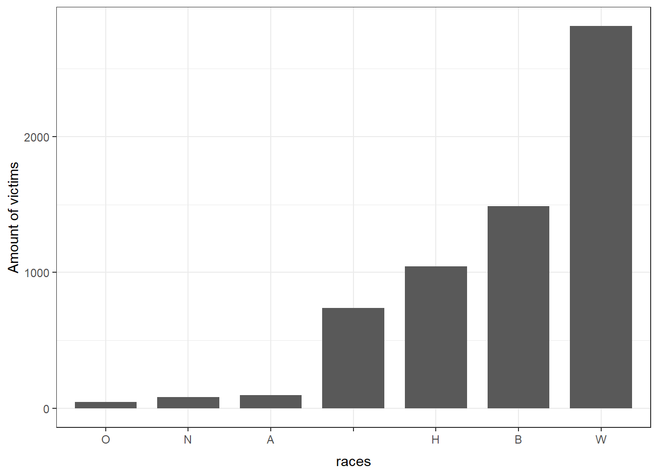
Before we officially start, as the histogram shows, the amount of victims who are white is actually the largest. The bar that has no label are the records where the victims’ race was unknown.
Now, we read, select, and cleans the poverty data from US census website at: https://www.census.gov/data-tools/demo/saipe/#/?map_geoSelector=aa_c
# load data
poverty <- read.csv("../../../dataset/Merge-with-County/2015-2019SAIPE by Age by County(1).csv")
# select useful columns
poverty <- poverty[,c(1,2,3,4,6,10,41)]

# remove rows that counts the whole states or whole country poverty
poverty[!grepl("000", poverty$County.ID),]

poverty <- poverty %>% filter(!str_detect(County.ID, "000")) %>%
  filter(!(County.ID == "0"))

# find the state of each observation
n_last <- 4
poverty$state <- substr(poverty$State...County.Name, nchar(poverty$State...County.Name) - n_last + 2, nchar(poverty$State...County.Name) - 1) # Extract the two character name of states

# find the county name of the observation
poverty$County <- substr(poverty$State...County.Name,1, nchar(poverty$State...County.Name) - n_last )
# drop the column State...County.name
poverty <- select(poverty,-c(State...County.Name))

# find the year of the shooting case
shooting_with_county$Year <- as.POSIXct(shooting_with_county$date)
shooting_with_county$Year <- strtoi(format(shooting_with_county$Year, format = "%Y"))

# change the GEOID to integer
shooting_with_county$GEOID <- strtoi(shooting_with_county$GEOID)
Now this dataset includes numbers of people in a county who are in poverty and the relative percentages. We also included median household income in dollars. We here use only the counts of number of people in poverty since poverty rates would be blunted by the total amount of population: if the population is larger for some counties, it would be harder to see how many people actually suffer in living in poverty.
# Data cleaning: remove all commas and $'s in columns which should be
# interpreted as numeric.
poverty$All.Ages.in.Poverty.Count <- as.numeric(gsub(",", "", poverty$All.Ages.in.Poverty.Count))
poverty$Median.Household.Income.in.Dollars <- as.numeric(gsub("[$,]", "",poverty$Median.Household.Income.in.Dollars))
# It sucks that there is a trailing whitespace in each row of "County"
poverty$County <- trimws(poverty$County, which = "right", whitespace = "[ \t\r\n]")
poverty$X <- NULL

shooting_with_county$state <- str_remove(shooting_with_county$state, ",.*$")
shooting_with_county$county <- str_remove(shooting_with_county$county, ",.*$")

shooting.joined <- left_join(shooting_with_county, poverty,
                             by = c("Year" = "Year",
                                    "state" = "state",
                                    "county" = "County"))
# Unable to remove NAs with the following way due to data type issue
#nonNAIndex <- complete.cases(shooting.joined[,c("All.Ages.in.Poverty.Count",
#                                                "All.Ages.in.Poverty.Percent",
#                                                "Median.Household.Income.in.Dollars")])

# BTW, remove the first two columns which are useless
#shooting.joined <- shooting.joined[nonNAIndex,c(-1, -2)]

saveRDS(shooting.joined, "shooting_joined_sf_obj.rds")
# IMPORTANT: read the sf object with: readRDS("{path}/shooting_joined_sf_obj.rds")
After we joined the datasetsets, we found that we cannot directly display both the amount of people in poverty and the shooting locations by applying tm_polygons becasue joined dataset merely consists of spatial points. Hence, we would save this joined dataset for subsequent analysis of modeling. We utilized the usmap package, which includes the county map, to show both the shooting locations and the people living in poverty on the map.
Here, we filter out the missing values and separate the data into five years to see 1) if there is any trend, 2) if the trend is consistent over some time duration.
options(warn = -1)

shootings <- read.csv("../../../dataset/fatal-police-shootings-data.csv")

clean <- filter(shootings, age != "", armed != "", gender != "", race != "", city != "", flee != "")
clean <- na.omit(clean)
# Remove a spot not in the US
clean <- clean[-which(clean$id == 5618),]
clean$Year <- as.POSIXct(clean$date)
clean$Year <- strtoi(format(clean$Year, format = "%Y"))

# subset the variables about location
shootings_2015 <- clean %>% filter(Year == 2015)
shootings_2016 <- clean %>% filter(Year == 2016)
shootings_2017 <- clean %>% filter(Year == 2017)
shootings_2018 <- clean %>% filter(Year == 2018)
shootings_2019 <- clean %>% filter(Year == 2019)

# location <- clean[c("date","city","state","longitude","latitude")]
location_2015 <- shootings_2015[c("date","city","state","longitude","latitude")]
location_2016 <- shootings_2016[c("date","city","state","longitude","latitude")]
location_2017 <- shootings_2017[c("date","city","state","longitude","latitude")]
location_2018 <- shootings_2018[c("date","city","state","longitude","latitude")]
location_2019 <- shootings_2019[c("date","city","state","longitude","latitude")]
# omit NA and blank(missing) values
location_2015 <- na.omit(location_2015)
location_2016 <- na.omit(location_2016)
location_2017 <- na.omit(location_2017)
location_2018 <- na.omit(location_2018)
location_2019 <- na.omit(location_2019)

coord_2015 <- location_2015[c("longitude", "latitude")]
coord_2015 <- usmap_transform(coord_2015)

coord_2016 <- location_2016[c("longitude", "latitude")]
coord_2016 <- usmap_transform(coord_2016)

coord_2017 <- location_2017[c("longitude", "latitude")]
coord_2017 <- usmap_transform(coord_2017)

coord_2018 <- location_2018[c("longitude", "latitude")]
coord_2018 <- usmap_transform(coord_2018)

coord_2019 <- location_2019[c("longitude", "latitude")]
coord_2019 <- usmap_transform(coord_2019)


# divide poverty into 5 different years
poverty_2015 <- poverty %>% filter(Year == "2015")
poverty_2016 <- poverty %>% filter(Year == "2016")
poverty_2017 <- poverty %>% filter(Year == "2017")
poverty_2018 <- poverty %>% filter(Year == "2018")
poverty_2019 <- poverty %>% filter(Year == "2019")
Now, we start making the map for each year and the shootings that took place in that year.
options(warn = -1)
# rename the column to fit the map function
poverty_2015$fips <- poverty_2015$County.ID

# divide 2015 poverty count into 6 parts to make the breaks
quantiles <- (0:6) / 6  # how many quantiles we want to map
poverty_2015 <- na.omit(poverty_2015)
quantile.vals <- quantile(poverty_2015$All.Ages.in.Poverty.Count, quantiles,
                          names = F)

# plot the county map with 2015 poverty count and 2015 shooting points
plot_usmap(region = "counties",
           data = poverty_2015,
           values = "All.Ages.in.Poverty.Count",
           color = "black",
           lwd = 0.3) +
  scale_fill_binned(name = "Count",
                    breaks = quantile.vals,
                    type = "viridis",
                    label = scales::comma) +
  theme(legend.position = "right") +
  geom_point(data = coord_2015,
             aes(x = longitude.1, y = latitude.1),
             color = "red",
             alpha = 1,
             lwd = 0.1) +
  theme(legend.position = "right") +
  labs(title = "2015 Shootings & Number of People in Poverty")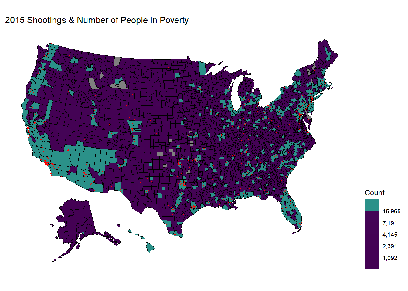
# remove useless dataframe
rm(shooting_sf,county_df)
To make a clearer graph, we have categorized these regions according to the quantiles of the distribution of the people in poverty, so that counties with a high amount of people in poverty do not outweigh the other counties, making them blend in with the rest.
We indeed see some correlation between the location of the shootings (in red dots) and the counties / states that have more people living in poverty (the regions filled by color green). These regions are mainly around the west coast, New Mexico, the South, Florida, the East Northern coast, and somewhat equally distributed in the eastern regions.
We now create the map for the year 2016.
options(warn = -1)
# rename the column to fit the map function
poverty_2016$fips <- poverty_2016$County.ID

# divide 2016 poverty count into 6 parts to make the breaks
quantiles <- (0:6) / 6  # how many quantiles we want to map
poverty_2016 <- na.omit(poverty_2016)
quantile.vals <- quantile(poverty_2016$All.Ages.in.Poverty.Count, quantiles,
                          names = F)

# plot the county map with 2016 poverty count and 2016 shooting points
plot_usmap(region = "counties",
           data = poverty_2016,
           values = "All.Ages.in.Poverty.Count",
           color = "black",
           lwd = 0.3) +
  scale_fill_binned(name = "Count",
                    breaks = quantile.vals,
                    type = "viridis",
                    label = scales::comma) +
  theme(legend.position = "right") +
  geom_point(data = coord_2016,
             aes(x = longitude.1, y = latitude.1),
             color = "red",
             alpha = 1,
             lwd = 0.1) +
  theme(legend.position = "right")+
  labs(title = "2016 Shootings & Number of People in Poverty")
# remove useless dataframe
rm(shooting_sf,county_df)
Here, we see almost the same pattern while some counties are now filled with green color as the amount of people living in poverty increased more than the largest quantile.
We now observe the 2017, 2018, and 2019 data.


 Observations:
As the three maps all show similar patterns, we can conclude that there should exist some relationship between the number of people living in poverty and the sites of police shootings. More specifically, the shootings are mostly near clusters in California, Washington, central and northern Texas, Florida, East Northern coast (Massachusetts and New York), and spaced mainly within the eastern regions.
Observations:
As the three maps all show similar patterns, we can conclude that there should exist some relationship between the number of people living in poverty and the sites of police shootings. More specifically, the shootings are mostly near clusters in California, Washington, central and northern Texas, Florida, East Northern coast (Massachusetts and New York), and spaced mainly within the eastern regions.
Summary: Our next step would be to find the possible explanations behind the police shootings and the poverty counts. These measures could include creating a regression model that incorporate more factors that give more information between the two’s relationship.