We have already combined three datasets together:
the poverty data “Small Area Income and Poverty Estimates (SAIPE)” downloaded from https://www.census.gov/data-tools/demo/saipe/#/?map_geoSelector=aa_c (we only take several useful columns like All.Ages.in.Poverty.Count, All.Ages.in.Poverty.Percent, and Median.Household.Income.in.Dollars from this dataset );
the county geometry from R package tidycensus;
our previous shooting dataset.
We join the county geometry from R package tidycensus with our previous shooting dataset by using spatial join according to each county’s geometry. THen, we joined this dataset wih the poverty data by left join based on the year, state, and county name. This process is just the same as what we have done in 11/4 blog post. Based on the comments, we did some improvements on our graphing and explanations.
We load the original poverty data first and do some basic explorations.
# Average People in Poverty from 2015-2019
mean_poverty = poverty_counts %>%
  filter(!str_detect(State...County.Name, '\\('), State...County.Name!= "United States") %>%
  group_by(State...County.Name, State, County.ID) %>%
  mutate(avg_state = mean(All.Ages.in.Poverty.Count)) %>%
  select(Year, State, County.ID, State...County.Name, All.Ages.in.Poverty.Count, avg_state)
ggplot(mean_poverty) +
  # geom_point(aes(x=avg_state, y = fct_reorder(as_factor(State), avg_state, .fun=mean)))+
  geom_text(aes(x=avg_state, y = fct_reorder(as_factor(State), avg_state, .fun=mean), label = State...County.Name), hjust = 0, size = 2.5) + labs(x = "Average Poverty Counts", y = "State Number")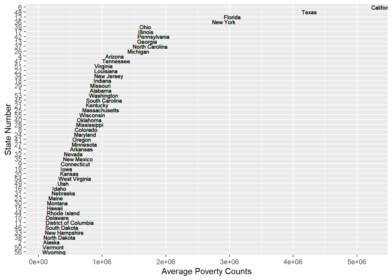
ggplot(mean_poverty) + geom_boxplot(aes(avg_state)) 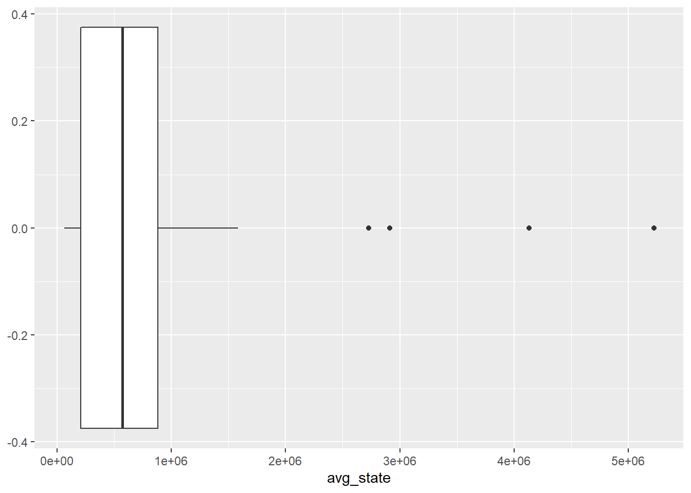
From the above graph of average poverty counts of each state, we can find that the are some gaps between the state with lots of poverty counts and state with lower poverty counts. It is not a perfect continuous line which means some states becomes outliers especially states California, Texas, New York and Florida. The reason why these states have more poverty counts could probably be that these states have more population than other states which lead to more poverty people. For instance, New York and California are big state with huge population. We have another thought that probably the higher average income of these states make the people there who are not that poor be considered as poverty. For example, New York and California are wealthy states and people live there usually have higher income which lead people who are not that poor being considered as a poor man.
mean_median_income = poverty_counts %>%
  filter(!str_detect(State...County.Name, '\\('), State...County.Name!= "United States") %>%
  group_by(State...County.Name, State, County.ID) %>%
  mutate(avg_median = mean(Median.Household.Income.in.Dollars)) %>%
  select(Year, State, County.ID, State...County.Name, Median.Household.Income.in.Dollars, avg_median)

ggplot(mean_median_income) +
  # geom_point(aes(x=avg_state, y = fct_reorder(as_factor(State), avg_state, .fun=mean)))+
  geom_text(aes(x=avg_median, y = fct_reorder(as_factor(State), avg_median, .fun=mean), label = State...County.Name), hjust = 0, size = 2.5) + labs(x = "Average Median Income", y = "State Number")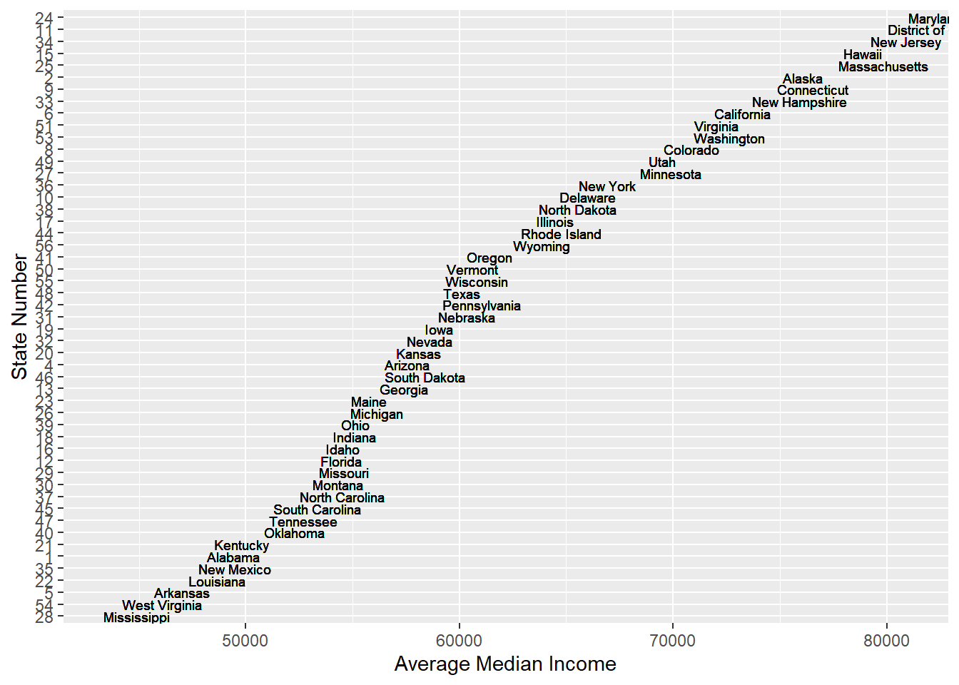
ggplot(mean_median_income) + geom_boxplot(aes(avg_median))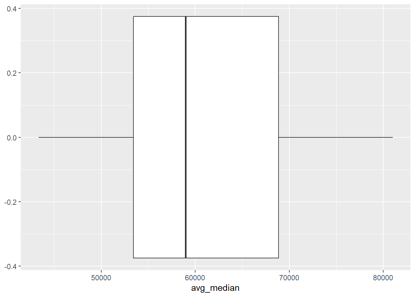
From the graph of Average Meidan income of each state, we find that one of the previous assumption is rejected. People in New York, California or Texas don’t have much higher income than people from other states. Instead, the median income of people in state which have less poverty counts are relatively high. For instance, the poverty counts of New Hampshire are really low and the median income of New Hampshire are high. Thus, we need to focus more on the population which might be a great reason for higher poverty counts.
shooting.joined = readRDS("../../../dataset/Merge-with-County/shooting_joined_sf_obj.rds")## Warning in readRDS("../../../dataset/Merge-with-County/
## shooting_joined_sf_obj.rds"): strings not representable in native encoding will
## be translated to UTF-8# extract state num and state name
state_name = shooting.joined %>% select(State, state) %>% unique() %>% na.omit()
# join state name
poverty_counts1 = poverty_counts %>% left_join(state_name, by = 'State') %>% filter(!is.na(state))
mean_median_county = poverty_counts1 %>%
filter(str_detect(State...County.Name, 'County'), State...County.Name!= "United States") %>%
group_by(State...County.Name, State, County.ID) %>%
mutate(avg_median_county = mean(Median.Household.Income.in.Dollars)) %>%
select(Year, State, County.ID, State...County.Name, Median.Household.Income.in.Dollars, avg_median_county, state)
ggplot(mean_median_county) +
geom_histogram(aes(avg_median_county, fill = as.factor(state)), bins = 100) + labs(x = "Averge of Median Household Income of County", y = "Freqeuncy")## Warning: Removed 5 rows containing non-finite values (stat_bin).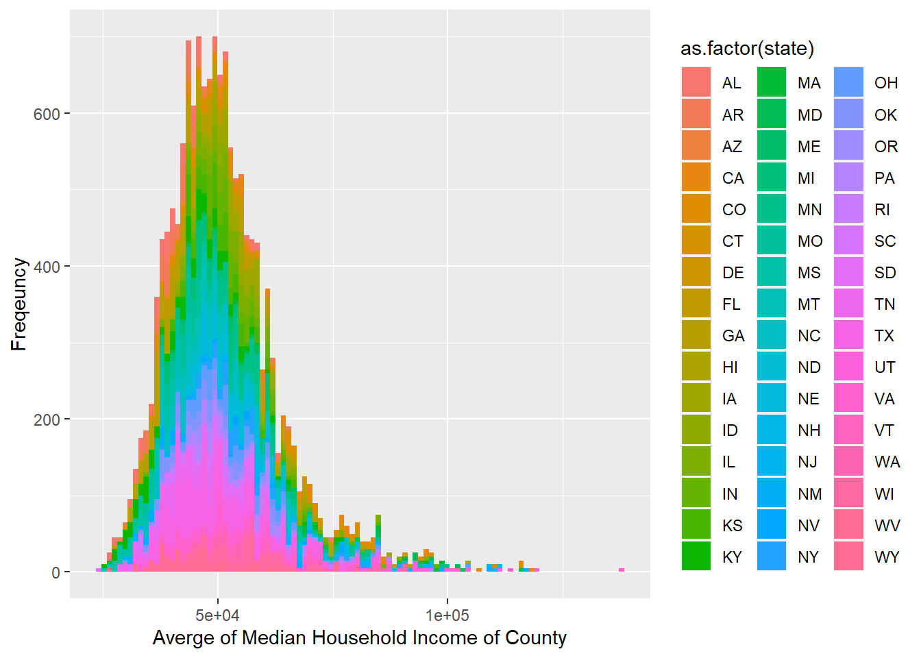
ggplot(mean_median_county) + geom_boxplot(aes(Median.Household.Income.in.Dollars))## Warning: Removed 5 rows containing non-finite values (stat_boxplot).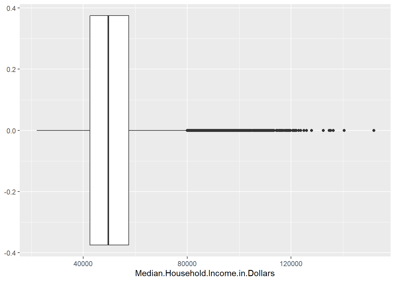
The graph above shows that although People in New York, California or Texas don’t have much higher median income than people from other states, these states still contain the majority of instances of high income. For example, we can only find pink, blue, orange, and green, which stands for TX, NY, CA, and MA, distributed on x-axis greater than 100k.
After analyzing the poverty situation from the state level, we think that using the state poverty condition is not specific enough because the poverty condition can be more precise by exploring from a county level. We then consider to use the poverty information from the county level to explore the relationship between the locations of each shooting case and the corresponding measure of poverty.
Moreover, we utilized county rather than tract as our geographic entity. There are more than 3,000 distinctive counties and more than 73,000 tracts in the United States. There are too many tracts and mapping by tracts might be harder to explore the pattern. Besides, it is not that frequent for people to mention tract in daily life. Accordingly, using county is more reasonable and practical way.
Next, we did some improvements on the repetitive code and the coloring problems in blog post 4. We are still using the us_map because it can help us to color the county’s poverty situation in color and meanwhile each exact shooting position can be illustrated on the map. We starts by cleaning the dataset and then writing a function to draw the map in each year.
options(warn = -1)

shootings <- read.csv("../../../dataset/fatal-police-shootings-data.csv")

clean <- filter(shootings, age != "", armed != "", gender != "", race != "", city != "", flee != "")
clean <- na.omit(clean)
# Remove a spot not in the US
clean <- clean[clean$id != 5618,]
clean$Year <- strtoi(format(as.POSIXct(clean$date), format = "%Y"))

clean <- clean %>% filter(Year < 2020)
coord <- clean[c("longitude", "latitude", "Year")]
coord <- usmap_transform(coord)

# load data
poverty <- read.csv("../../../dataset/Merge-with-County/2015-2019SAIPE by Age by County(1).csv")
# select useful columns
poverty <- poverty[,c(1,2,3,4,6,10,41)]

# remove rows that counts the whole states or whole country poverty
poverty <- poverty[!grepl("000$", poverty$County.ID),] %>%
  filter(County.ID != "0")

# find the state of each observation
n_last <- 4
poverty$state <- substr(poverty$State...County.Name, nchar(poverty$State...County.Name) - n_last + 2, nchar(poverty$State...County.Name) - 1) # Extract the two character name of states

# find the county name of the observation
poverty$County <- trimws(str_match(poverty$State...County.Name,
                                   "^[a-zA-Z ]*"))

poverty$All.Ages.in.Poverty.Count <- as.numeric(gsub(",", "", poverty$All.Ages.in.Poverty.Count))

poverty$fips <- poverty$County.ID


quantiles <- (0:6) / 6  # how many quantiles we want to map
poverty.rmNA <- na.omit(poverty)
quantile.vals <- quantile(as.numeric(poverty.rmNA$All.Ages.in.Poverty.Count), quantiles, names = F)

poverty$count_breaks <- rep(NA, nrow(poverty))
label.order <- character()
for (i in seq(6)) {
  label <- paste0(round(quantile.vals[i]), "~", round(quantile.vals[i+1]))
  poverty$count_breaks[poverty$All.Ages.in.Poverty.Count >= quantile.vals[i] &
                         poverty$All.Ages.in.Poverty.Count < quantile.vals[i+1]] <- label
  label.order <- c(label.order, label)
}
poverty$count_breaks[poverty$All.Ages.in.Poverty.Count == quantile.vals[7]] <- label
poverty$count_breaks[is.na(poverty$All.Ages.in.Poverty.Count)] <- NA
label.order <- c(label.order, NA)
poverty$count_breaks <- factor(poverty$count_breaks, levels = label.order)


poverty <- poverty[,c(1,10,11)]
coord <-na.omit(coord)
plot_usmap(region = "counties",
           data = poverty,
           values = "count_breaks",
           color = "black",
           lwd = 0.3, na.rm = TRUE) +
  scale_fill_manual(name = "Count",
                    values = c("#f7f7f7", "#d1e5f0", "#92c5de",
                               "#4393c3", "#2166ac", "#053061")) +
  facet_wrap(~Year, drop=TRUE) +
  theme(legend.position = "right") +
  geom_point(data = coord,
             aes(x = longitude.1, y = latitude.1),
             color = "red",
             alpha = 1,
             lwd = 0.1) +
  theme(legend.position = "right") +
  facet_wrap(~Year)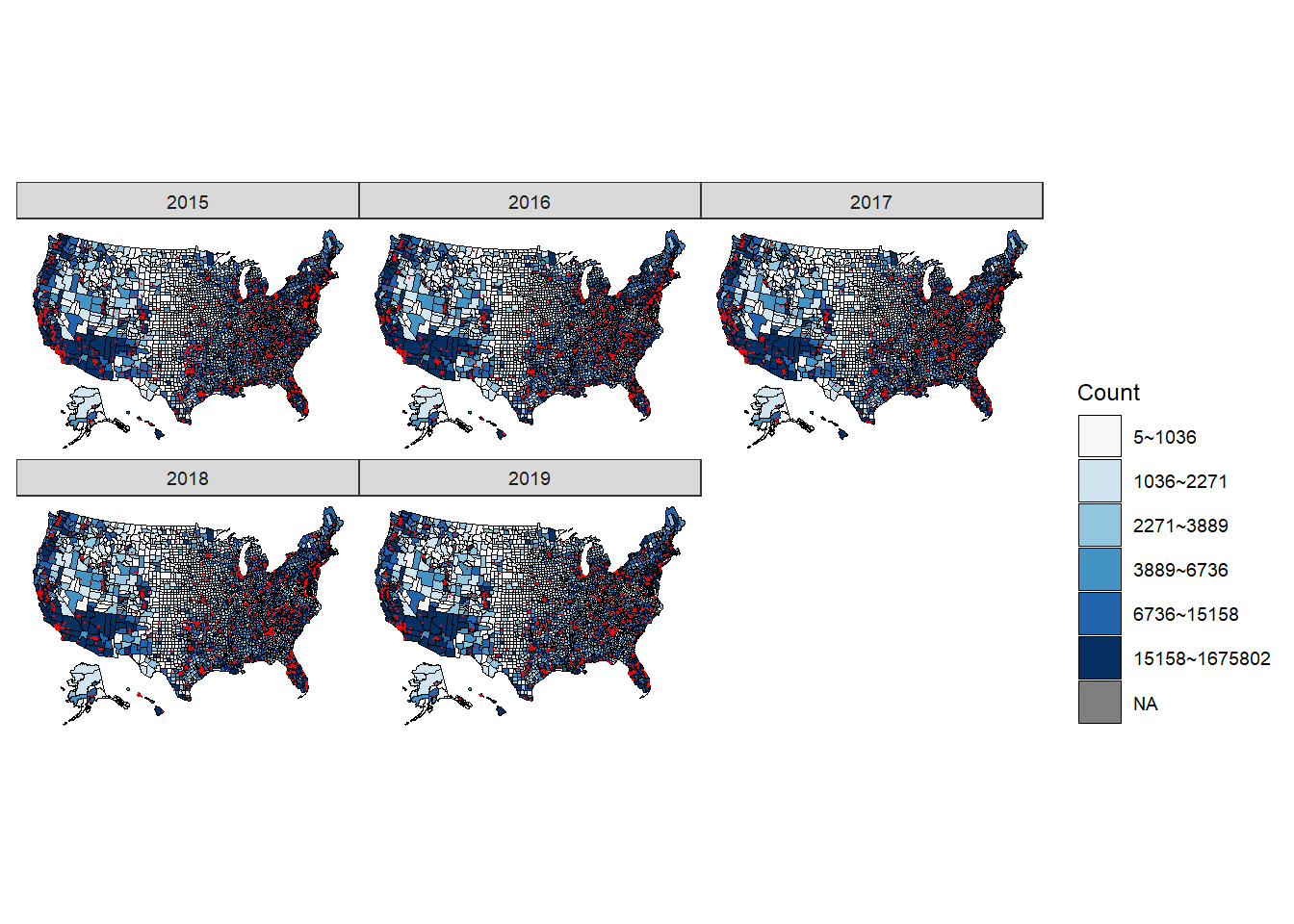
Observation and conclusion: All five figures show a consistent and similar pattern. We think that based on the graph, there is a positive correlation between the location of the shootings (in red dots) and the counties that have more people living in poverty (the regions filled by darker blue). More specifically, the shootings are mostly clustered around California, Washington, central and northern Texas, Florida, East Northern coast (Massachusetts and New York), and spaced mainly within the eastern regions.