# Average People in Poverty from 2015-2019
mean_poverty = poverty_counts %>%
filter(!str_detect(State...County.Name, '\\('), State...County.Name!= "United States") %>%
group_by(State...County.Name, State, County.ID) %>%
mutate(avg_state = mean(All.Ages.in.Poverty.Count)) %>%
select(Year, State, County.ID, State...County.Name, All.Ages.in.Poverty.Count, avg_state)
ggplot(mean_poverty) +
# geom_point(aes(x=avg_state, y = fct_reorder(as_factor(State), avg_state, .fun=mean)))+
geom_text(aes(x=avg_state, y = fct_reorder(as_factor(State), avg_state, .fun=mean), label = State...County.Name), hjust = 0, size = 2.5)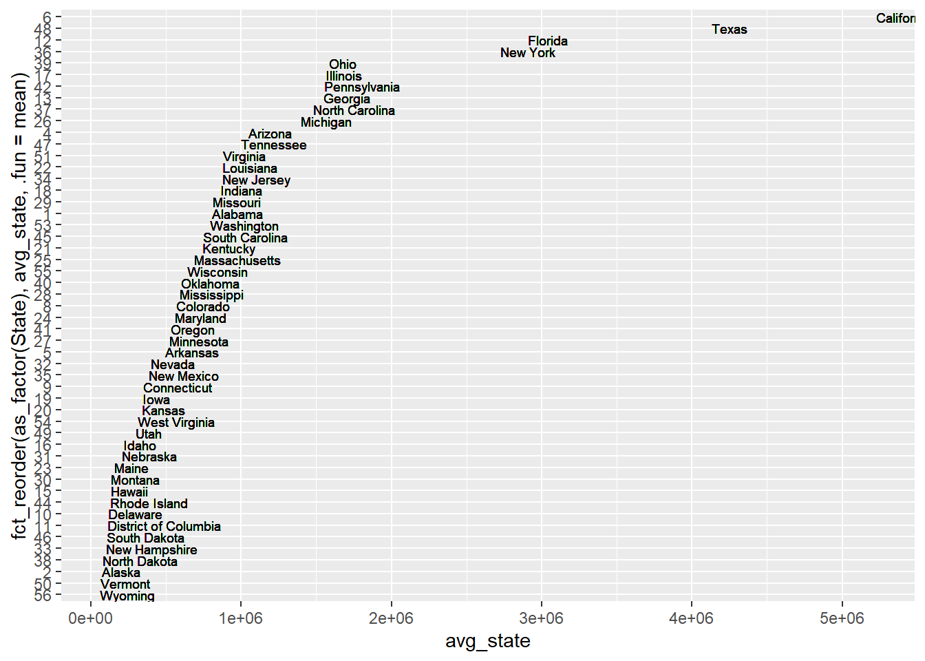
ggplot(mean_poverty) + geom_boxplot(aes(avg_state))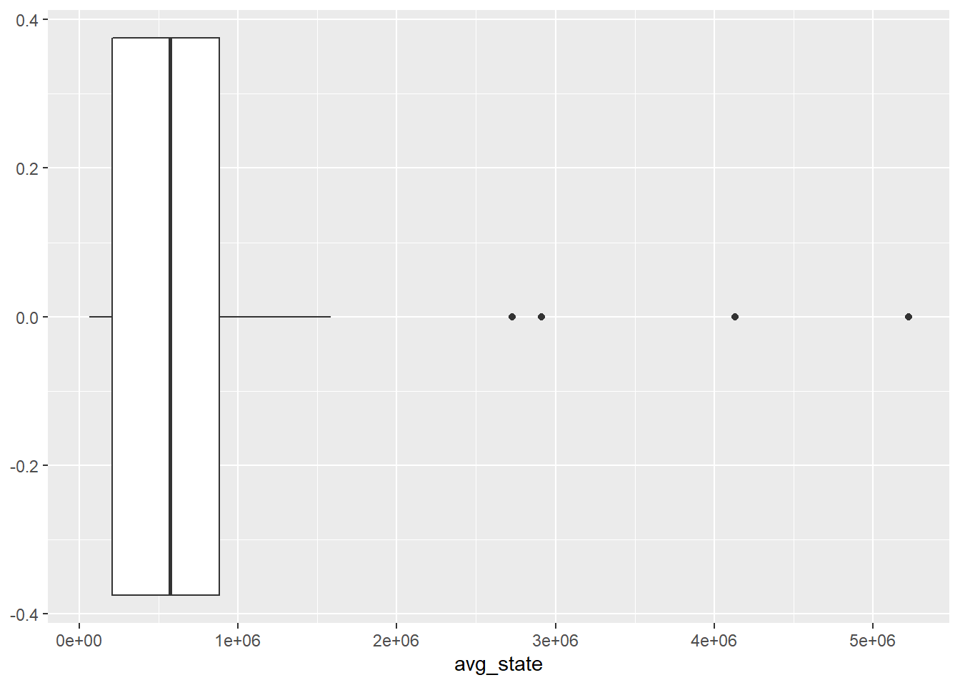 From the above graph of average poverty counts of each state, we can find that the are some gaps between the state with lots of poverty counts and state with lower poverty counts. It is not a perfect continuous line which means some states becomes outliers especially states California, Texas,New York and Florida. The reason why these states have more poverty counts could probabily be that these states have more population than other states which lead to more poverty people. For instance, New York and California are big state with huge population. We have another thought that probabily the higher average income of these states make the people there who are not that poor be considered as poverty. For example, New York and California are wealthy states and people live there usually have higher income which lead people who are not that poor being considered as a poor man.
mean_median_income = poverty_counts %>%
filter(!str_detect(State...County.Name, '\\('), State...County.Name!= "United States") %>%
group_by(State...County.Name, State, County.ID) %>%
mutate(avg_median = mean(Median.Household.Income.in.Dollars)) %>%
select(Year, State, County.ID, State...County.Name, Median.Household.Income.in.Dollars, avg_median)
ggplot(mean_median_income) +
# geom_point(aes(x=avg_state, y = fct_reorder(as_factor(State), avg_state, .fun=mean)))+
geom_text(aes(x=avg_median, y = fct_reorder(as_factor(State), avg_median, .fun=mean), label = State...County.Name), hjust = 0, size = 2.5) + labs(x = "Average Median Income", y = "State Number")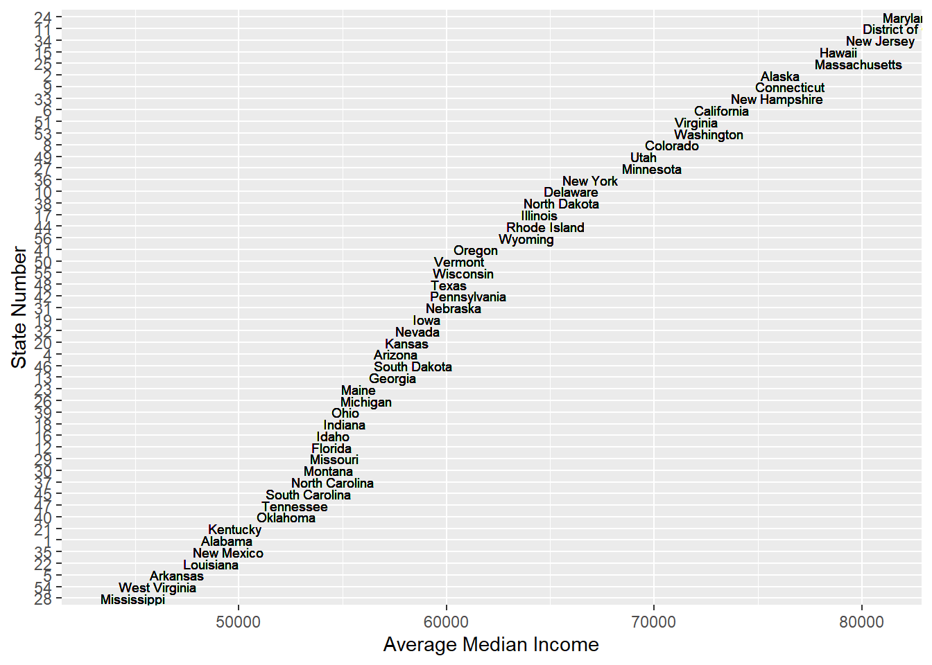
ggplot(mean_median_income) + geom_boxplot(aes(avg_median))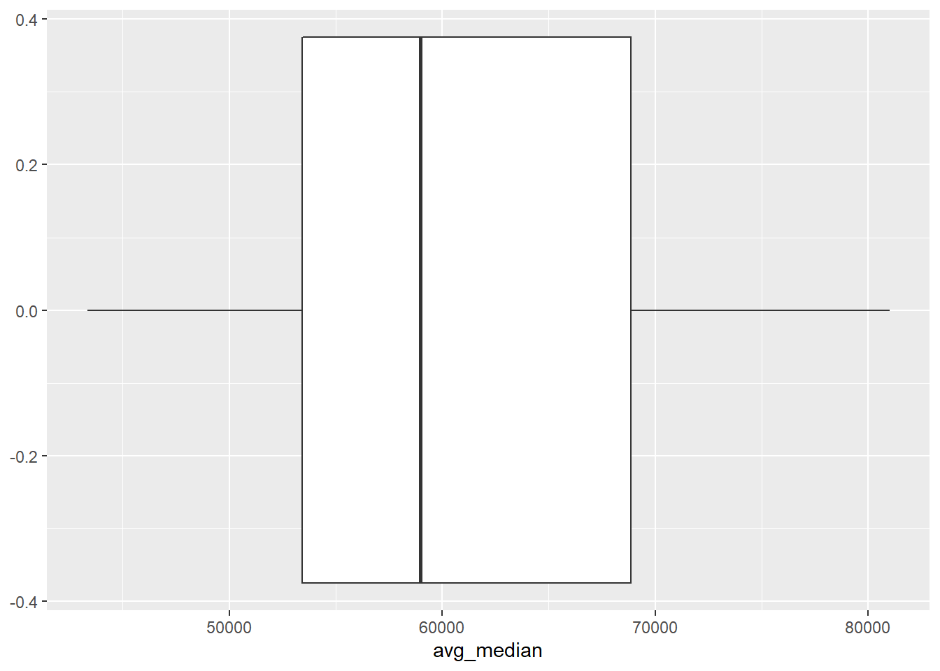 From the graph of Average Meidan income of each state, we find that one of the previous assumption is rejected. People in New York, California or Texas don’t have much higher income than people from other states. Instead, the median income of people in state which have less poverty counts are relatively high. For instance, the poverty counts of New Hampshire are really low and the median income of New Hampshire are high. Thus, we need to focus more on the population which might be a great reason for higher poverty counts.
shooting.joined = readRDS("../../../dataset/Merge-with-County/shooting_joined_sf_obj.rds")
mean_median_county = poverty_counts %>%
filter(str_detect(State...County.Name, 'County'), State...County.Name!= "United States") %>%
group_by(State...County.Name, State, County.ID) %>%
mutate(avg_median_county = mean(Median.Household.Income.in.Dollars)) %>%
select(Year, State, County.ID, State...County.Name, Median.Household.Income.in.Dollars, avg_median_county)
ggplot(mean_median_county) +
geom_histogram(aes(avg_median_county, fill = as.factor(State)), bins = 100) + labs(x = "Averge of Median Household Income of County", y = "Freqeuncy")## Warning: Removed 5 rows containing non-finite values (stat_bin).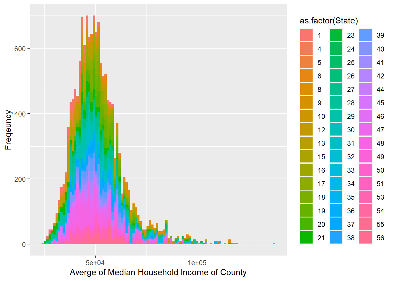
ggplot(mean_median_county) + geom_boxplot(aes(Median.Household.Income.in.Dollars))## Warning: Removed 5 rows containing non-finite values (stat_boxplot).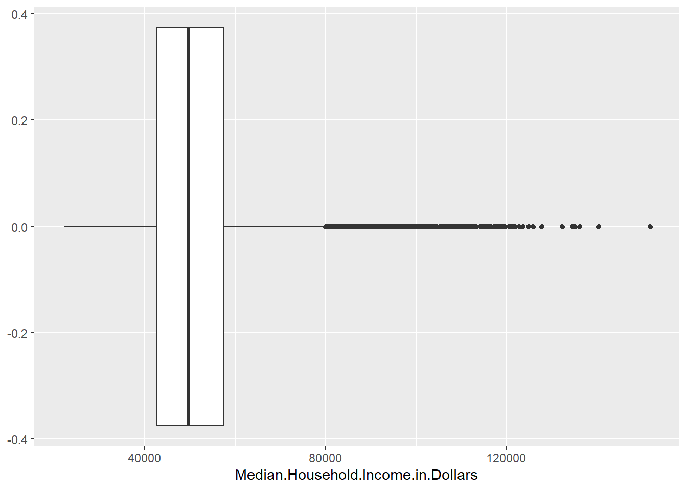
shootings <- read.csv("../../../dataset/Merge-with-County/fatal-police-shootings-data.csv")
clean <- filter(shootings, age != "", armed != "", gender != "", race != "", city != "", flee != "")
clean <- na.omit(clean)
clean$Year <- strtoi(format(as.POSIXct(clean$date), format = "%Y"))
clean <- clean %>% filter(Year < 2020)
# Clean up longitude X latitude that do not falls in "state"
library(sf)## Linking to GEOS 3.9.1, GDAL 3.2.1, PROJ 7.2.1library(spData)## To access larger datasets in this package, install the spDataLarge
## package with: `install.packages('spDataLarge',
## repos='https://nowosad.github.io/drat/', type='source')`## Convert points data.frame to an sf POINTS object
pts <- st_as_sf(clean[c("longitude", "latitude")], coords = 1:2, crs = 4326)
## Transform spatial data to some planar coordinate system
## (e.g. Web Mercator) as required for geometric operations
states <- st_transform(spData::us_states, crs = 3857)
pts <- st_transform(pts, crs = 3857)
## Find names of state (if any) intersected by each point
state_names <- states$NAME
ii <- as.integer(st_intersects(pts, states))
state_names <- c(state_names, "Alaska", "Hawaii")
out_names <- state_names[ii]
out_abb <- state.abb[match(out_names, state.name)]
to_remove_idx <- clean$state != out_abb & !clean$state %in% c("HI", "AK")
clean <- clean[!to_remove_idx,]
clean <- na.omit(clean)
coord <- clean[c("longitude", "latitude", "Year", "state")]
# load data
poverty <- read.csv("../../../dataset/Merge-with-County/2015-2019SAIPE by Age by County(1).csv")
# select useful columns
poverty <- poverty[c("Year", "County.ID", "State...County.Name",
"All.Ages.in.Poverty.Percent")]
# remove rows that counts the whole states or whole country poverty
poverty <- poverty[!grepl("000$", poverty$County.ID),] %>%
filter(County.ID != "0")
# find the state of each observation
n_last <- 4
# Extract the two character name of states
poverty$state <- substr(poverty$State...County.Name,
nchar(poverty$State...County.Name) - n_last + 2,
nchar(poverty$State...County.Name) - 1)
# find the county name of the observation
poverty$County <- trimws(str_match(poverty$State...County.Name,
"^[a-zA-Z ]*"))
# drop the column State...County.name
#poverty <- select(poverty,-c(State...County.Name))
#poverty$All.Ages.in.Poverty.Count <- as.numeric(gsub(",", "", poverty$All.Ages.in.Poverty.Count))
#poverty$Median.Household.Income.in.Dollars <- as.numeric(gsub("[$,]","",poverty$Median.Household.Income.in.Dollars))
poverty$fips <- poverty$County.ID
# Devide regions
# Use R builtin data
regionTable <- data.frame(abb = state.abb,
region = as.character(state.region))
regionTable$region[regionTable$abb %in% c("HI", "AK")] <- "Pacific"
allRegions <- unique(regionTable$region)
allStates <- list()
for (r in allRegions) {
allStates[[r]] <- regionTable$abb[regionTable$region == r]
}
plotYearRegion <- function(year, region) {
# Filter the coordinates for "region" in "year"
coord_yr <- coord[coord$Year == year &
coord$state %in% allStates[[region]],]
coord_yr <- coord_yr[c("longitude", "latitude", "Year")]
coord_yr <- usmap_transform(coord_yr)
# Filter the poverty data for "region" in "year"
poverty_yr <- poverty[poverty$Year == year &
poverty$state %in% allStates[[region]],]
poverty_yr <- poverty_yr[c("Year", "All.Ages.in.Poverty.Percent", "fips")]
# Make plot
p <- plot_usmap(region = "counties",
data = poverty_yr,
include = allStates[[region]],
values = "All.Ages.in.Poverty.Percent",
color = "black",
lwd = 0.3) +
scale_fill_continuous(low = "white", high = "darkgreen",
name = "Poverty Percentage (%)",
label = scales::comma, limits = c(0, 60)) +
theme(legend.position = "right") +
geom_point(data = coord_yr,
aes(x = longitude.1, y = latitude.1),
color = "red",
alpha = 1,
lwd = 0.3) +
theme(legend.position = "right") +
labs(title = paste("Poverty Percentage VS Shooting Cases for",
region, "Region in", year))
plty <- plotly::ggplotly(p)
return(plty)
}South Region
2015
2016
2017
2018
2019
Pacific Region
2015
2016
2017
2018
2019
West Region
2015
2016
2017
2018
2019
Northeast Region
2015
2016
2017
2018
2019
North Central Region
2015
2016
2017
2018
2019
Thesis: we hope to find out what extent is racial discrimination a problem within the police system and whether some data, provided that they are accurate, would be counter-intuitive to information we previously accepted and considered as accurate. Also, we try to use the data of police shootings from 2015 to 2019 to combine the data of poverty counts, poverty rate and household income to investigate the relationship between poverty rate and shooting counts. Does poverty lead people to commit crimes which should be the reason for police shooting?